Fraxion
Modernizing enterprise procurement software to reduce friction and improve clarity for finance teams.

Fraxion was entering a period of growth and product evolution. While the underlying procurement platform was powerful, the experience had begun to feel dated and increasingly clunky for users navigating complex financial workflows.
As the company scaled and expanded feature depth, it became clear the interface no longer reflected the sophistication of the product. The goal was modernization — not just visually, but structurally — improving usability across core workflows while supporting new functionality over time.
Product UX Modernization
Workflow Simplification
UI Redesign & Visual Refresh
Information Hierarchy Improvements
Feature Expansion Support
Design System & Component Refinement
Scope
fraxion.biz
Role & Ownership
DodgeUX served as the design lead and strategic UX partner on the engagement. While working alongside additional design support, DodgeUX directed overall experience strategy, workflow restructuring, and system-level decisions across the platform.
Ownership included defining the information architecture, simplifying complex procurement workflows, establishing a modernized visual system, refining interaction patterns, and guiding component-level consistency to support scalability. Work was carried out in direct collaboration with the CEO and engineering stakeholders, ensuring alignment between user experience, product vision, and technical feasibility.
Rather than executing isolated screens, the focus was on shaping how the system functioned end-to-end, elevating the platform’s usability while supporting continued feature growth.

The Real Problem
As Fraxion’s platform evolved, the user experience struggled to keep pace. Screens were dense with information, dashboards were overloaded, and hierarchy was inconsistent across the system. Core approval workflows lacked clarity, creating friction for finance teams navigating already complex processes.
The interface reflected years of incremental growth rather than intentional design. Inconsistent UI patterns and cognitive overload made it harder for users to quickly understand what mattered, what required action, and how to move efficiently through procurement workflows.
For a platform supporting financial oversight and spend management, that lack of clarity created unnecessary friction at scale.
What Changed / Outcome
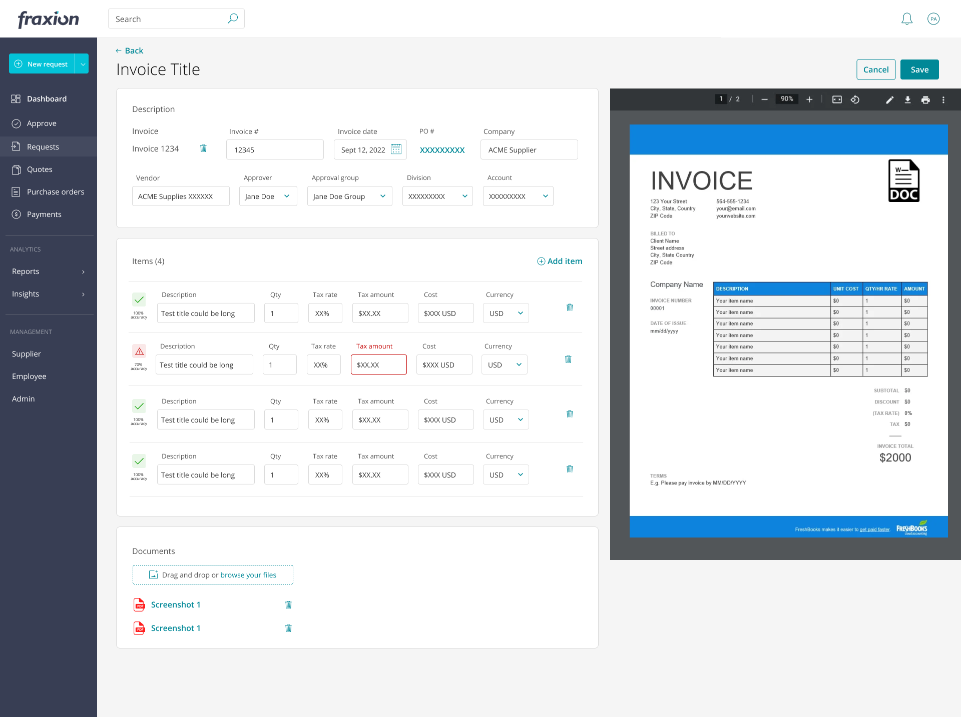
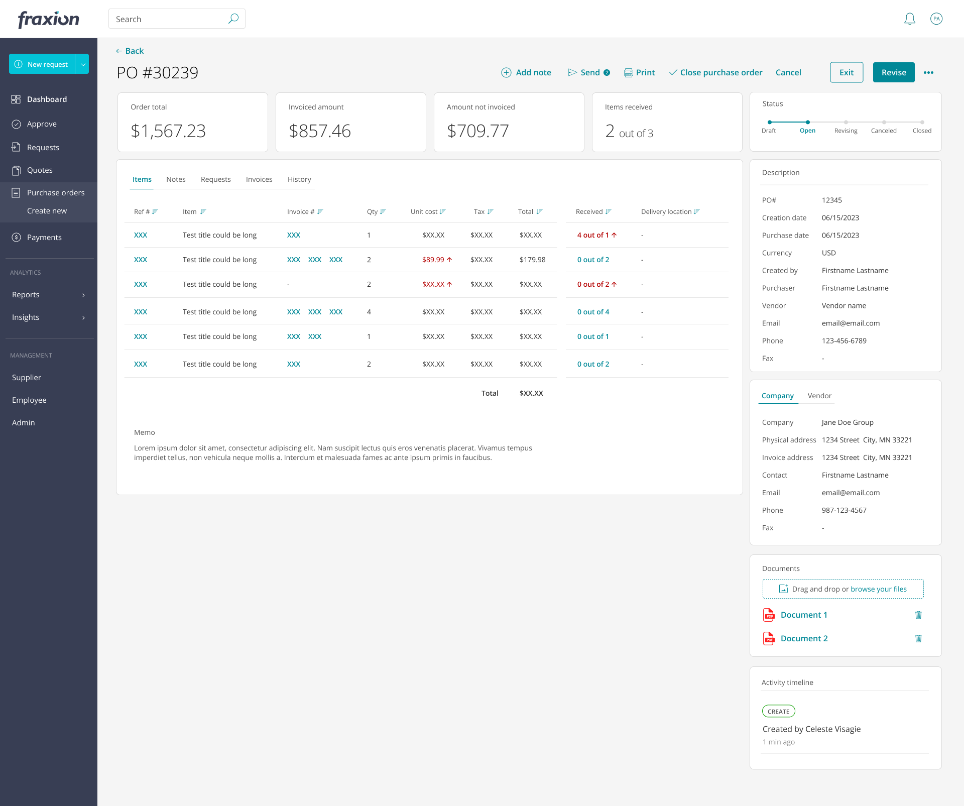
The platform evolved from dense, inconsistent interfaces into a clearer, more structured enterprise experience. Core procurement workflows were rebuilt into step-based interactions, reducing cognitive overload and making complex approvals easier to navigate.
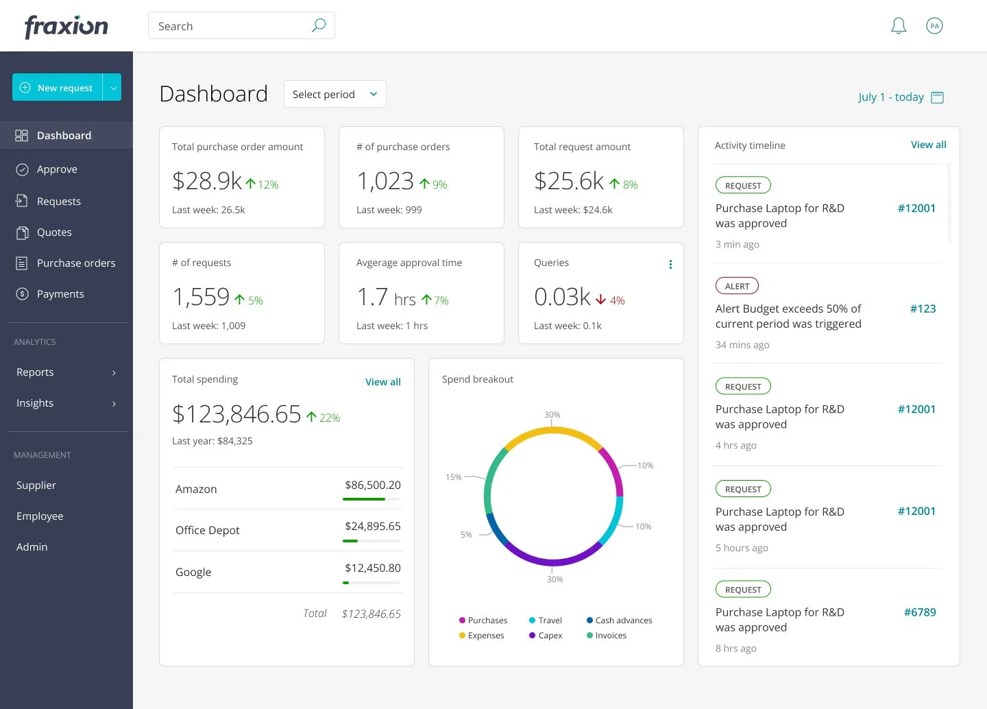
A redesigned dashboard gave users a more immediate understanding of business metrics, open requests, and required actions. Finance teams could quickly assess system status and prioritize work without digging through overloaded screens.
New submission and approval experiences simplified how users created, managed, and approved requests. Additional enhancements supported invoice data extraction and payment workflows, improving operational efficiency across the procurement lifecycle.
A modernized visual system introduced consistency across the application, replacing fragmented UI patterns with scalable standards that supported continued feature growth.
As a result, users completed tasks faster, approval errors decreased, and adoption improved. The redesigned foundation positioned the platform for continued expansion while aligning the experience with enterprise expectations.